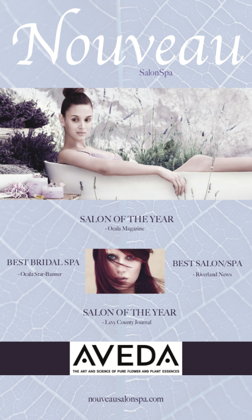
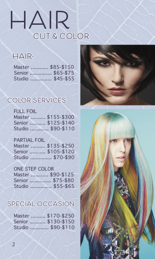
WEBSITE DESIGN
![PRS Gallery third portfolio piece for electric guitar website](http://camimareecreative.com/wp-content/uploads/elementor/thumbs/PRS-Gallery-scaled-ogq4jxmvwixcl1upkh65y82qbgwtzqdavbqqd1fc3k.png)
![second portfolio piece for electric guitar website](http://camimareecreative.com/wp-content/uploads/2019/11/02-PRS-About-768x449.png)
PROJECT
Website for a Paul Reed Smith Private Stock Guitar
PROBLEM
Design a new WordPress website to showcase the beauty and unique qualities of the exquisite PRS Private Stock guitar #7454.
SOLUTION
A black background was used to highlight the rich colors and pattern of this guitar. A slightly decorated typeface was used to complement the tone the guitar brings to the page, while a simple body typeface was used so as not to distract from the guitar itself. Brilliant photos were used to display the intricate detail of each angle of this guitar.
VISIT SITE: PRS Private Stock Guitar #7454
![first portfolio piece for electric guitar website](http://camimareecreative.com/wp-content/uploads/2019/11/PRSSHomeiMacMockup-768x633.png)
PRINT DESIGN
![MagSpreadFinalSpread1 portfolio piece magazine spread page 1](http://camimareecreative.com/wp-content/uploads/elementor/thumbs/MagSpreadFinalSpread1-ohzxnoisimn1b28xc3xkwzo26u1xz8kq61jvg7tn80.png)
![MagSpreadFinalSpread2 portfolio piece magazine spread page 2](http://camimareecreative.com/wp-content/uploads/elementor/thumbs/MagSpreadFinalSpread2-ohzxqi1d0qi04y5gvbtaea1ucg5l2jrqk00ba3n4k0.png)
PROJECT
Travel magazine spread highlighting Italy’s Amalfi Coast
PROBLEM
Create a four-page magazine spread that will accurately represent the Amalfi Coast, and be visually enticing to readers so that they will read the article.
SOLUTION
Vibrant images of the historic structures and coastline of Amalfi were used to showcase the magnificence of this area. A heavy cream background was pulled from the color of the structures in the images to give cohesion to the spread. The type color is a deep blue that was also pulled from the images to bring further unity to the design. A scripted typeface was used for the title to represent the soft yet grand feel of the Amalfi Coast, while a simple, highly legible typeface was used for the body to best present the information to the readers. The layout of the images and text guides the readers through the article.
PRINT DESIGN
![BrochureFrontCover](http://camimareecreative.com/wp-content/uploads/elementor/thumbs/BrochureFrontCover-oi0mxbu0fpvmxuxmmt4zexzxtsim2ata8dp1z92zka.png)
![BrochureInterior1](http://camimareecreative.com/wp-content/uploads/elementor/thumbs/BrochureInterior1-oi0mvlsnwnipnlfqp2bludnimd0dy9yzzun0azmyyy.png)
![BrochureInterior2](http://camimareecreative.com/wp-content/uploads/elementor/thumbs/BrochureInterior2-oi0mvnocablaatd0e34uzd6ft4r4do6go3xz9jk6mi.png)
![BrochureInterior4](http://camimareecreative.com/wp-content/uploads/elementor/thumbs/BrochureInterior4-oi0myh6wsfg94p9jxb0kgnk7yqurgzdh22ef3fdnyi.png)
![BrochureInterior3](http://camimareecreative.com/wp-content/uploads/elementor/thumbs/BrochureInterior3-oi0myede7xce5vdndrsor69u6l8ntw2a1ofynlhuh6.png)
PROJECT
Nouveau SalonSpa promotional brochure
PROBLEM
Design a brochure for Nouveau SalonSpa that displays the salon services, pricing, and locations, while representing the atmosphere of the salon.
SOLUTION
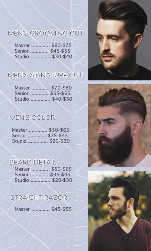
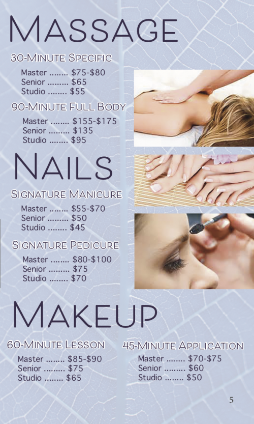
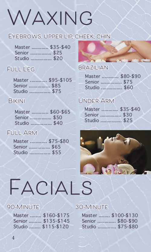
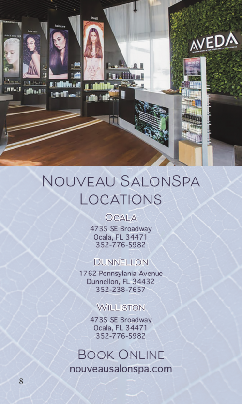
The texture of a leaf was implemented as the background of the brochure to represent the salon’s belief in using plant-based ingredients in their products and services, while a pale blue overlay was added to give a soft, luxurious feel. A deep violet was used as the type color and accent color to further add to the luxurious essence. High quality images of services performed by the salon professionals were used to accurately represent what the salon offers. The layout chosen provides all the required information in an aesthetically pleasing and reader friendly fashion.
![BrochureBackCover](http://camimareecreative.com/wp-content/uploads/elementor/thumbs/BrochureBackCover-oi0mxvkmf8mnpo4yfjo5db0mavtbjxznb3e9229pxm.png)
![BrochureInterior5](http://camimareecreative.com/wp-content/uploads/elementor/thumbs/BrochureInterior5-oi0n136rrv0xdph0ofn9dzubd9zgupqmqzmz33iaoa.png)
![BrochureInterior6](http://camimareecreative.com/wp-content/uploads/elementor/thumbs/BrochureInterior6-oi0n160acd4scjcx7yv53h4p5flkht1trdlfixe45m.png)
WEBSITE DESIGN
PROJECT
Visual Essence
PROBLEM
Create four web page illustrations for four different companies that represent the unique visual essence for each company using the same layout, only changing content.
SOLUTION
ACME Beauty: Shades of gray and pink come together to capture the mature, feminine elegant essence of the salon. A gradient background was used to provide dimension to the web page as well as contrast with images and text in order to bring to light the work of the stylists. High quality images of the stylists’ work were used to show the salon’s style, and the images were edited to match the more muted tones of the grays and pinks, which creates unity in the design. A simple script was used for the company name to also portray a mature elegance.
![SalonVisualEssence portfolio piece for salon website](http://camimareecreative.com/wp-content/uploads/elementor/thumbs/SalonVisualEssence-scaled-ogq84iy0vkwtit1ioc6dyyduslqy7dxsfc7ktx6k1s.jpg)
SOLUTION
ACME Bakery: The colors of chocolate were used in this design to express the essence of this bakery. High quality images that show detail of the baked goods were used to showcase the work of the baker and draw the reader into the page. A slightly translucent and darkened image of flour and eggs on a counter was used as the header background to contribute to the baking focus of this web page. A script was used for the subheadings throughout the page to create unity across the page.
![portfolio piece for bakery website](http://camimareecreative.com/wp-content/uploads/elementor/thumbs/BakeryVisualEssence-scaled-ogq7z5b9rpjr34us30h8pb8wf89c5ql30ptjyx5nnk.jpg)
SOLUTION
ACME Trucking: The green and yellow tones of this page bring the feel of comfort, and accentuate the hometown, family-oriented essence of this trucking company. The green used is pulled from the header image to bring unity to the work. A gray asphalt background was used to symbolize the road which is in line with what a trucking company is about. The high-quality images used represent the ideals of the company. The images were edited to be of similar tone to greater emphasize the message of this page.
![portfolio piece for trucking website](http://camimareecreative.com/wp-content/uploads/elementor/thumbs/TruckingVisualEssence-scaled-ogq8bs95niuj6ehyah4o84fzxpyzn8r639kk8uf400.jpg)
SOLUTION
ACME Law: A deep blue to symbolize wisdom and trust, and a deep red to symbolize ambition and power, were used as accent colors to exemplify the essence of this law firm. The background image of a courtroom represents the law, and the scholarly script used for “law” in the company name further promotes the educational aspect of a law firm. The main image used embodies the trust feel that the law firm required.
![portfolio piece for law firm website](http://camimareecreative.com/wp-content/uploads/elementor/thumbs/LawFirmVisualEssence-scaled-ogq826cjshp0hwgeeblyqjqdbxbwymly3phvn0nzls.jpg)
WEBSITE DESIGN
![First portfolio piece for Gal Gadot fan website](http://camimareecreative.com/wp-content/uploads/elementor/thumbs/Gal-Gadot-Home-scaled-ogqaf26125ooeajggc1cnyhlvtibmiw2vycxazxv58.png)
PROJECT
Fan website for Gal Gadot
PROBLEM
Develop a WordPress website that exemplifies the career and character of celebrity Gal Gadot. The site must include facts about the actress, a gallery of images, and a merchandise store.
SOLUTION
On the home page a closeup image of Gal Gadot was used as the header image to bring attention to her soft beauty and give a glimpse of her personality. A muted pink and soft burgundy were used for the background and accent colors to complement to header image and to show a fierce femininity. Double burgundy borders are used around images through-out the website to separate them from the background and pull more attention to the images. The title typeface is decorated to coincide with the “Wonder Woman” persona. The entire website maintains a simple and clean mood to accentuate the actress’s fierce beauty shown in the images.
VISIT SITE: Gal Gadot Fan Site
![portfolio piece Gal Gadot Fan website gallery](http://camimareecreative.com/wp-content/uploads/2019/12/Gall-Gadot-Gallery-FULL-630x1536.png)
WEBSITE & LOGO DESIGN
PROJECT
Small business hand coded website
PROBLEM
Design a logo and hand coded website for Heart and Soul Studios that gives customers a glimpse of what the studio has to offer as well as provides customers with examples of their work.
SOLUTION
The logo colors of purple and gray together represent calmness and creativity. The unique typeface of the logo expresses the individuality of the studio. The microphone stands for recording, and the heart monitor line has a dual purpose of representing the heart as well as sound waves to pull this logo together. This studio is very professional with a flare for the heart and soul. The website implements the color scheme of the logo to be unified with the company branding. Each page contains the required information – images of the studio, services the studio offers, and mp3 and video examples of the studio’s work.
VISIT SITE: Heart and Soul Studios
![portfolio piece heart and soul studios website samples](http://camimareecreative.com/wp-content/uploads/elementor/thumbs/Heart-and-Soul-Samples-FULL-scaled-ohzxxbd8khtub6942ruwz255e0kdvjtohqa1jbjgai.png)
![portfolio piece for music studio logo](http://camimareecreative.com/wp-content/uploads/elementor/thumbs/StudioLogoFinal-ogqe54v68uwgzpc2b9uh2pgiaxdueog54n189ja9cq.png)
![portfolio piece heart and soul studios website home](http://camimareecreative.com/wp-content/uploads/2019/12/Heart-and-Soul-Home.png)
WEBSITE & LOGO DESIGN
![CrownBlackNew portfolio item freedom renovations crown](http://camimareecreative.com/wp-content/uploads/elementor/thumbs/CrownBlackNew-ohu3idju5ugwltv8of5m9x3regkgh7lygoybv89q0w.png)
![portfolio item freedom renovations business card front](http://camimareecreative.com/wp-content/uploads/2019/12/FRBusinessCardFront-300x171.png)
![portfolio item freedom renovations business card back](http://camimareecreative.com/wp-content/uploads/2019/12/FRBusinessCardBack-300x171.png)
![FreedomLSBlackFront2 portfolio item freedom renovations shirt front](http://camimareecreative.com/wp-content/uploads/elementor/thumbs/FreedomLSBlackFront2-ohu4261i29kjajsga0h21h85vg8s6q635e7ang6s5c.png)
![FreedomLSBlackBack portfolio item freedom renovations shirt back](http://camimareecreative.com/wp-content/uploads/elementor/thumbs/FreedomLSBlackBack-ohu4237zhrgobpwjqh96bzxs3amojmuw508u7mayo0.png)
PROJECT
Construction company branding
PROBLEM
Create a logo, stationery system, and shirt design for a new construction company.
SOLUTION
The color scheme was chosen by the client. The crown (created in Adobe Illustrator) represents faith and freedom, which is the client’s basis for this company name. Clean lines and simplicity are used throughout the design to present the information clearly for the many age groups viewing the stationery system.
VISIT SITE: Freedom Renovations
![portfolio piece branding letterhead](http://camimareecreative.com/wp-content/uploads/2019/12/FRLetterhead.jpg)
![portfolio item freedom renovations logo](http://camimareecreative.com/wp-content/uploads/2019/12/FRLogoBlackTB-1024x247.png)
![FreedomRenovationsWebsiteHome portfolio piece freedom renovations website home](http://camimareecreative.com/wp-content/uploads/elementor/thumbs/FreedomRenovationsWebsiteHome-scaled-ohu32nozvl1p84qwh2myriwc3kqper2n7t714eqfpc.png)
![FREnvelope portfolio piece branding envelope](http://camimareecreative.com/wp-content/uploads/elementor/thumbs/FREnvelope-ohu3s37yvhlren5zonvgw48yvklqe6ef1c3yygknsg.jpg)
MOBILE WEBSITE DESIGN
PROJECT
Mobile website design
PROBLEM
Redesign The Heart of Florida Youth Ranch’s existing website, using hand coding, to be mobile friendly.
SOLUTION
The organization’s existing logo and color scheme were used for this mobile website. A long scroller was chosen for this project to provide ease to the user on a mobile device. A video highlighting the purpose and mission of the organization was used at the beginning of the page to immediately make a statement about who they are. A fully expanding hamburger menu with a translucent background was used to clearly show the menu options while still allowing the user to see the main page behind the menu. Clear bold titles and color bars clearly separate the sections of the site, while alternating color backgrounds give the text contrast and dimension. The mobile site includes all pertinent information a user would need from a mobile site, while not being cluttered with all the more in-depth details the full desktop site contains.
VISIT SITE: Heart of Florida Youth Ranch Mobile Site
![HofFLHome1Mockup portfolio piece mobile website page 1](http://camimareecreative.com/wp-content/uploads/elementor/thumbs/HofFLHome1Mockup-scaled-ohzuwb0vvwudc9w7khd63y80ps7873pxl1m0hl3dhc.png)
![HofFLHome3Mockup portfolio piece mobile website page 3](http://camimareecreative.com/wp-content/uploads/elementor/thumbs/HofFLHome3Mockup-scaled-ohzxhndwkmmga8b3ibwf7w8wea4fl1ac31uv5soxkw.png)
![HofFLHome5Mockup portfolio piece mobile website page 5](http://camimareecreative.com/wp-content/uploads/elementor/thumbs/HofFLHome5Mockup-scaled-ohzxl0n3298fvxeyuabanjnd0zis5znpjq0i2hp5a8.png)
![HofFLHome2Mockup portfolio piece mobile website page 2](http://camimareecreative.com/wp-content/uploads/elementor/thumbs/HofFLHome2Mockup-scaled-ohzvaza6ksvt7ck0vlo4fxf1esiwjc1j57re47r9j4.png)
![HofFLHome4Mockup portfolio piece mobile website page 4](http://camimareecreative.com/wp-content/uploads/elementor/thumbs/HofFLHome4Mockup-scaled-ohzxjk04fj6ofzikdfit6lfilvdmd9x6w0zt44ac5c.png)
WEBSITE DESIGN
![SC Home page portfolio piece for suzanne collins website redesign](http://camimareecreative.com/wp-content/uploads/elementor/thumbs/SC-Long-Scroll-ogqe8ecxjfwfb3nxrvnppyyh6c0vqjtfnlvf516akg.png)
PROJECT
Existing website redesign
PROBLEM
Redesign (using hand coding) famous author Suzanne Collins’ website to better capture what she is known for, and to better present the information on her current website.
SOLUTION
The color scheme of a black background with orange accents was pulled from the books for which the author is most well-known. The header image of flames, and the block, gothic title typeface were used to match the character of the author’s popular series. All information from her current page was included in the re-design following in step with the home page to fit the mood of the author’s most popular series.
VISIT SITE: Suzanne Collins Re-design
![portfolio items suzanne collins redesign page 3](http://camimareecreative.com/wp-content/uploads/2019/12/SuzanneCollinsMovies-768x1434.png)
ILLUSTRATION
![VisualMetaphorWebsite portfolio item visual metaphor](http://camimareecreative.com/wp-content/uploads/elementor/thumbs/VisualMetaphorWebsite-scaled-ohu5mp232l0b4edhd7hycl45b475k1i3odtxqv7rwg.jpg)
PROJECT
Travel company visual metaphor
PROBLEM
Develop a homepage illustration for a travel company that is a metaphor for what the site is about. Create icon illustrations that represent the metaphor.
SOLUTION
A background image of a cork-board board and a map was used to show items pinned onto the board. This displays the idea of planning a trip which is fitting with a travel company’s purpose. Icons of airplane tickets, a passport, a compass, and map pins, were designed in illustrator to look as if the items are pinned to the board. A background of crumpled paper with the pin icons pinning it to the board was used behind icon titles to further convey the idea of this metaphor.
PRINT DESIGN
![Levy Fair Hanger Front portfolio item door hanger back](http://camimareecreative.com/wp-content/uploads/elementor/thumbs/Levy-Fair-Hanger-Front-ohu5tquibunq744u79781t2lp5g9abhmn9z1bkrh8g.png)
PROJECT
Promotional door hanger
PROBLEM
Design a promotional door hanger that would be appealing for potential customers of the Levy County Fair that includes the website, dates, price, selling points, and map of the location.
SOLUTION
The Levy County Fair existing logo was used in this design, while the colors were changed to enhance the image of this event. The colors blue and green were chosen to indicate a refreshing and imaginative joy in attempt to bring customers in with a fresh view of the fair. White lettering with a green stroke was used to give contrast to the titles from the background. The required information was arranged in such a way that guides the reader and allows the information to be easily viewed.
![Levy Fair Hanger Back portfolio item door hanger front](http://camimareecreative.com/wp-content/uploads/elementor/thumbs/Levy-Fair-Hanger-Back-ohu5tidymcc5amh4knjkxd7gcolyd1k1m43o0340sg.png)
PRINT DESIGN
![portfolio piece flyer for a cause](http://camimareecreative.com/wp-content/uploads/2019/12/12-TeenMomFlyer-791x1024.jpg)
PROJECT
Persuasive flyer promoting a cause
PROBLEM
Create a flyer for a cause that will persuade people to care about and support the cause of teen mothers.
SOLUTION
A gray background was chosen to bring an elegant, mature mood to this work. A deep purple was used for the title to communicate devotion. An image of a mother’s hand and baby’s hand was used to show the tenderness of a mother and child relationship. High-quality images (edited to similar and complementary tones) that express a mother’s love and joy were used to present something that can be seen as a negative into a positive light. The website of an organization that supports teen mothers was placed at the bottom of the flyer so that readers are guided to where they can support this cause.